iClaim Dashboard
iClaim Dashboard offers an overview of user engagement, campaign performance, and system activity by tracking:
- Records created
- Claims processed
- Service usage
- Platform interactions
The data is presented through intuitive graphs and charts, and you can filter it across the timeframes of 7 days, 30 days, and 90 days to identify trends and patterns and make data-driven decisions.
To open the iClaim Dashboard, go to the iClaim component and select Dashboard. 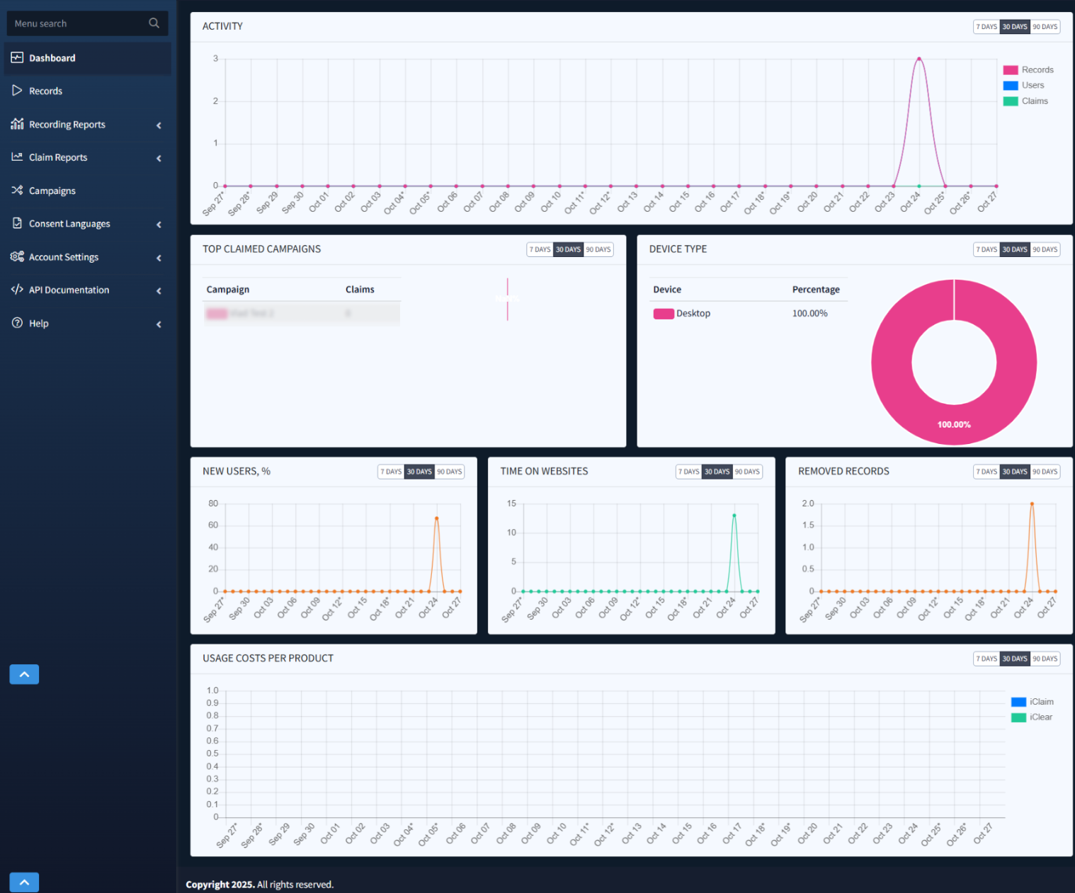
You can switch between 7 DAYS, 30 DAYS, and 90 DAYS to apply the selected date range to each particular block.
The information in this section is separated into the seven blocks:
- Activity: Records, Users, and Claims generated daily, which you can use to track performance and trends over time and identify changes.
- Top Claimed Campaigns: Campaigns ranked by the number of claims, with the pie chart displaying the percentage of each campaign claimed in a selected date range.
- Device Type: Device types used to access the system.
- New Users (%): New users visiting your web pages daily.
- Time on Websites: Longer times suggest higher engagement, while shorter ones could indicate quick conversions.
- Removed Records: Records removed as unclaimed within the selected timeframe.
- Usage Costs Per Product: Daily cost summary for iClaim (blue) and iClear (green), which allows you to monitor how your usage costs accumulate, including spikes and days with higher service consumption.